The Many Faces of Diary of a Caribbean Med Student
Do y’all remember when Diary of a Caribbean Med Student looked like this?
Yeah, it seemed so long ago for me, but only 3 months ago, this was what it looked like..
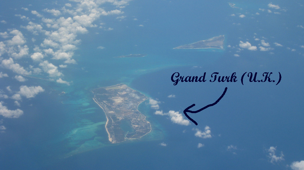
When I first started this blog, I was completely a novice at this medium of expression. I was not familiar with programming, and had to look up html tutorials on the internet. I found a theme on wordpress that I really liked, called Atahualpa, mainly because it allowed for customized headers. I didn’t want just bare-bone text for my title. I wanted something more unique. So I went online, typed in “Caribbean” in Google Image Search, and found a few free Caribbean wallpaper images and pasted a cursive font that looked very “diary-like” onto it. And there you go… my first blog design.

After I went back home for winter break, my brother, who is a programmer, showed me that I could actually customize my blog with style sheets. I have always heard of style sheets before but I had no idea I could modify it in wordpress. I had always assumed what was “clickable” on my Atahualpa theme options were “it.” Soon, he showed me how to make use of the ample white space available on the screen to make my blog easier to read. Before, I had four different header images that rotated every time the page is refreshed. I reduced it down to my favorite, the boat! I’ve always loved earthy colors and I felt the orange and blue of the boat, green of the water and brown of the sand was a colorful combination that really emphasized the “Caribbean” part of my blog’s title.

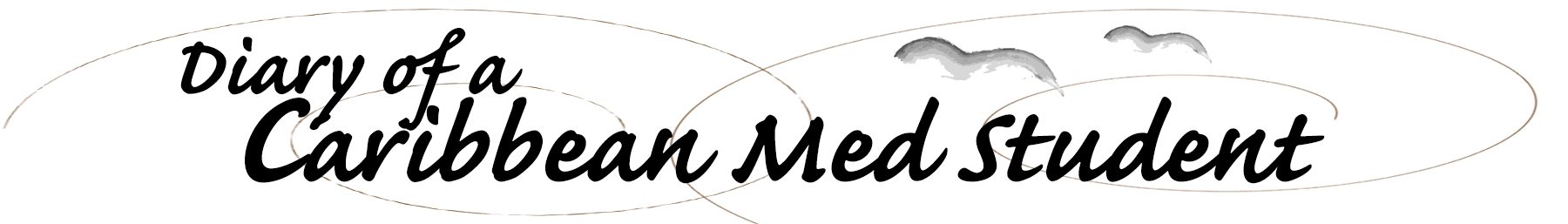
Although I liked the boat-themed blog design, I could never let myself accept the fact that the boat picture was not original. I felt the picture+text template was a little too easy for a logo. After looking at an article by Smashing Magazine about 50 New Beautiful Blog Designs, I was inspired. I wanted to create something that was more original, artistic, and honest. I didn’t want my blog to blatantly shout Caribbean. I wanted something more toned-down, something a lot more personal that emphasized the “Diary” in my blog title. I felt the use of subtle, yet complex colors, along with texture would convey this intimacy. I made the blog page look more like paper, mounted on a scrapbook. In the header image, I added everything that my personal diary would have.. doodles, pencil sketches, and messy writing. This is more me. This is now my diary.